The mission
Redesign the client's website to effectively communicate the variety of services the company offers to their clients.
The solution
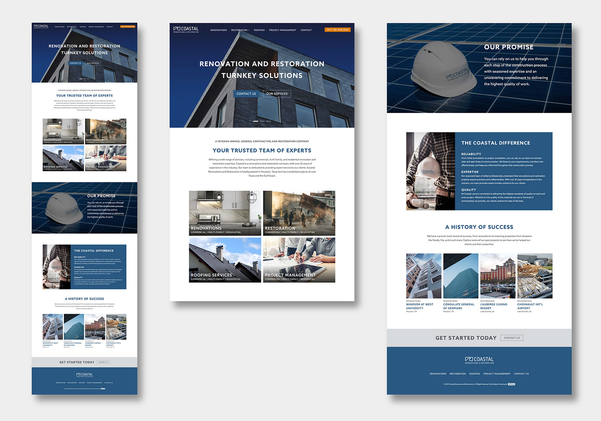
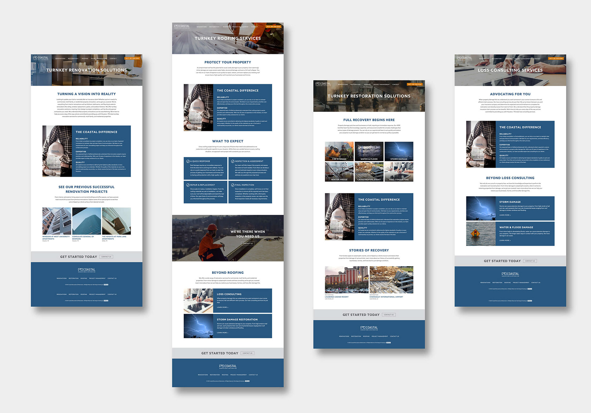
Coastal offers a wide variety of services so I wanted to make it easy for viewers to quickly navigate to their area of interest by creating four categories at the main navigation level as well as a visual navigation grid on the home page.
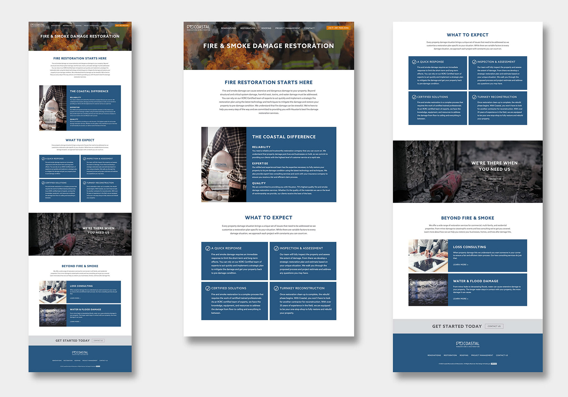
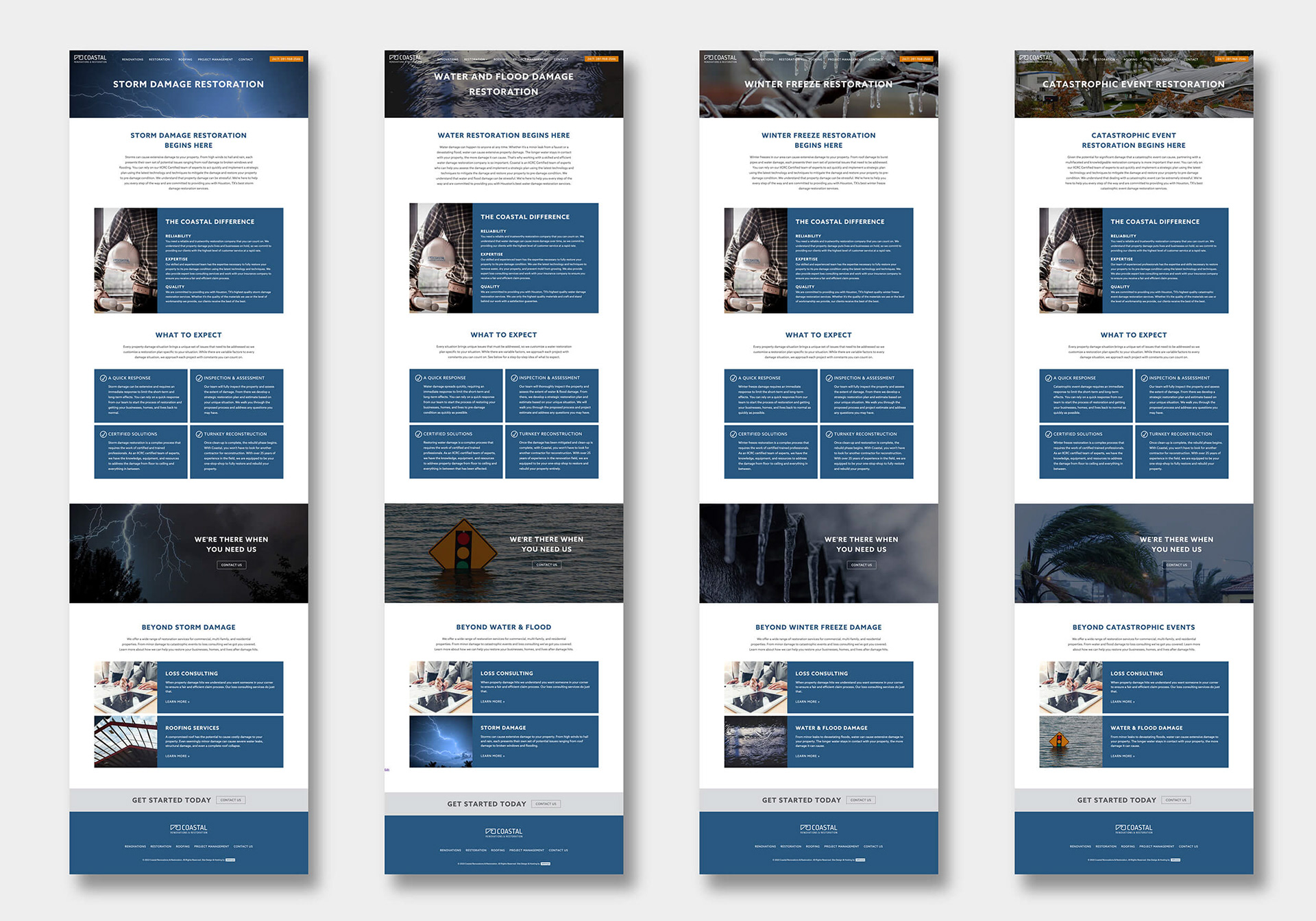
Because of the nature of their business, offering property renovation and restoration services, I wanted to convey a sense of trust from top to bottom throughout each page. Navigating renovation or restoration services after experiencing property damage can be very stressful for the client so emoting a feeling that this company can be trusted as a reliable and knowledgeable expert was a must. Speaking to the turnkey solutions they provide and what sets them apart from other companies communicates to the viewer that this is a company that can be trusted to manage and execute their project from start to finish without having to deal with multiple contractors on different phases of the construction process. Furthermore, outlining what to expect on restoration projects communicates that Coastal implements strategic constants in restoration projects that the client can count on in a situation where there are so many variables to address.
The color scheme drives home the above efforts to convey Coastal is a highly experienced company that clients can rely on. The blues in their branding and in the images I selected convey a sense of authority, professionalism, and trustworthiness. Orange is strategically incorporated as an accent color that invokes a sense of optimism and action while also having a strong connection to the construction industry. You'll see that all the images I selected throughout the site design align with this strategic color palette.