The mission
Redesign the client's website to effectively communicate to the viewer what the company is about, and answer all the frequently asked questions they receive in a concise and thoughtfully laid out manner that feels organic to the viewer as they make their way from the home page to interior pages.
The solution
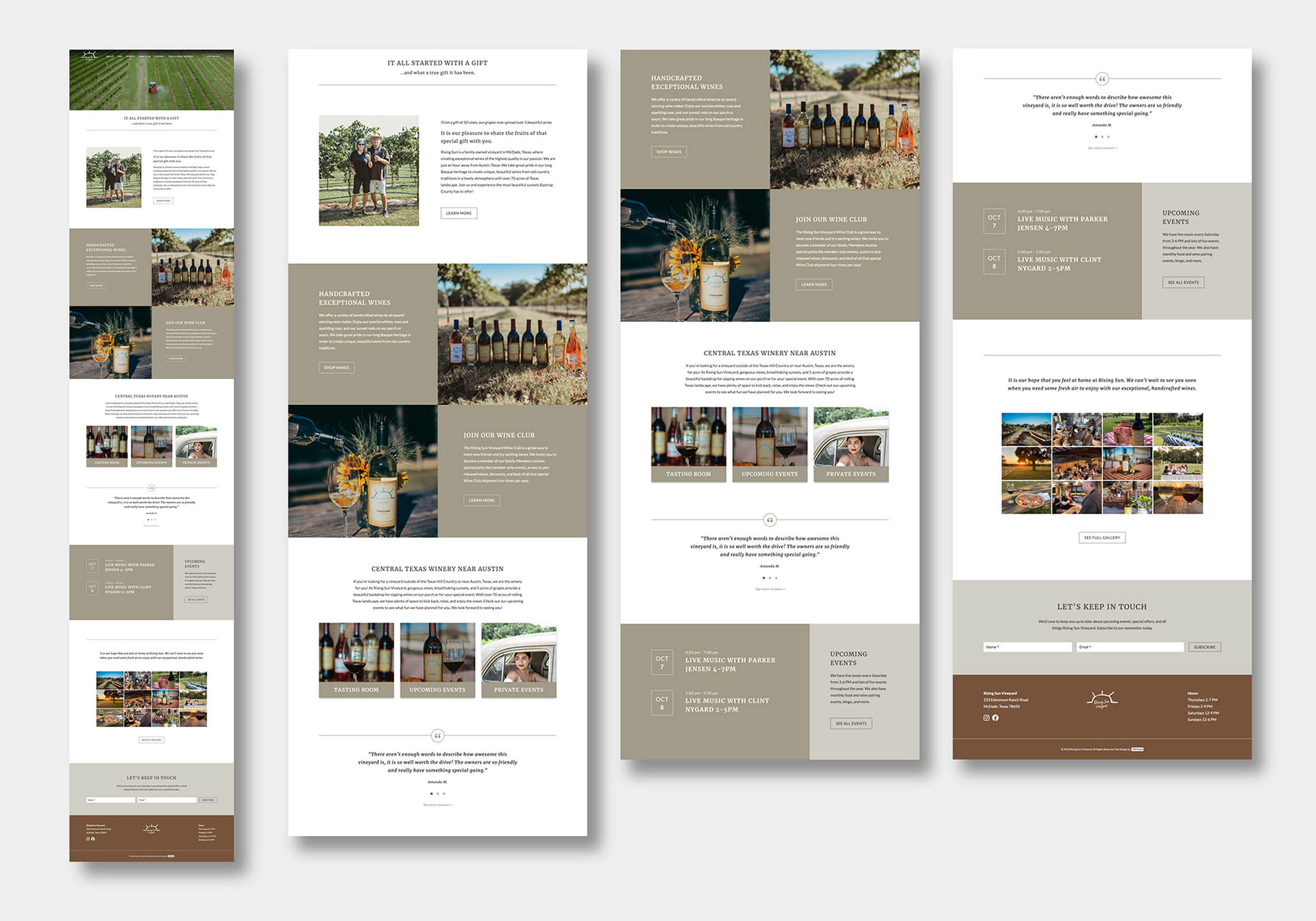
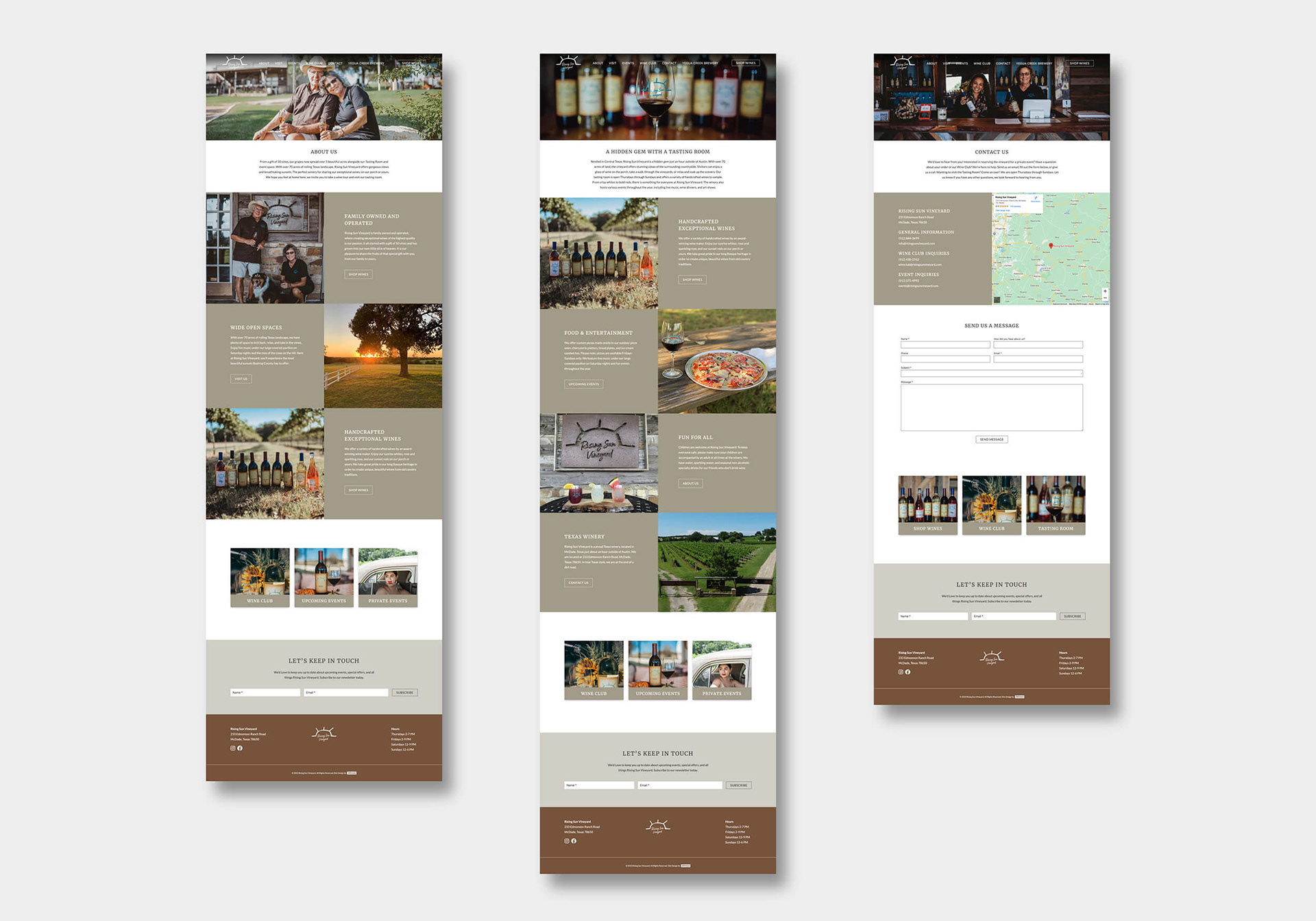
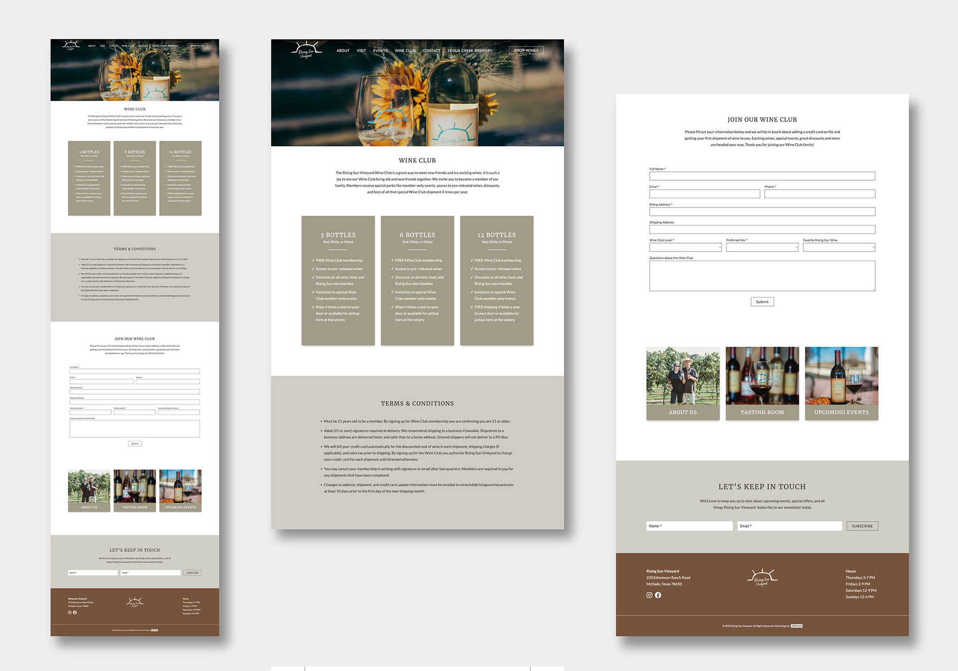
Upon reading a slew of raving google reviews, it was clear that a large part of the charm and allure of this vineyard is the feeling customers get when they visit and interact with the owners and staff. The owners are very warm and inviting so I wanted their website to emote that same feeling to their viewers. They take great pride in their land and product so incorporating an earthy feel felt like another way to tap into the emotion of feeling warm and welcome. To do this I focused on creating a color palette that consisted of duotones that were pulled from images of the soft warm tones of the dirt road that leads to their vineyard. I then paired that with a deeper accent color that was inspired by some of the coloring in the stones of their tasting room's exterior walls. To instantly pull the viewer in, I featured a video header on the home page hero section. I then laid out the information page by page to feel conversational with a natural progression as viewers learn more about the company and what they offer to their customers.